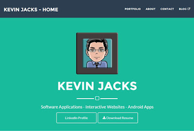
For a few years I've had the goal of creating my own website. This type of project would provide many benefits. It would give me a fun project to work on, it would expand my web programming & design skills, and it would allow me to create an online portfolio that could be used to show off my programming projects. There are many benefits to having your own website, but for the most part I wanted a chance to learn and show off my work.
 |
| 1st Design - Home |
In September 2015 I took my first steps to achieving this goal and registered my own domain. I immediately began working on the website in my spare time. I figured WordPress would be the best option, as it would allow for fast changes during the design stage. I watched some online tutorials, installed WordPress on my site, and began development. I created the page structure, a homepage, and a contact form before the semester got busy and I had to set the project aside. I would come back to it once the semester was over, but I had one big issue: I didn't know how to best show off my projects. The site was progressing, but truthfully I wasn't all that happy with how things looked from a design standpoint. It would need some work.
Towards the end of the semester we touched on Bootstrap in my Web Programming course. It seemed so easy to understand and implement. I loved it! I decided I was going to completely redesign my website using this, rather than rely on WordPress. Once the busy semester was over I dove back into my website project with a renewed vigor. I did some research and found an amazing theme by Start Bootstrap. The theme was Freelance and, like all of Start Bootstrap's themes, was completely free to use and edit. This was what I was looking for! Rather than have my website be made of thousands of files (as with WordPress) I knew what all of the files did and everything made sense. I could edit the pages using my favorite text editor and hand-code what I wanted. This was what I loved doing.
 |
| Final Design - Home |
Within a few hours I had the layout I wanted and most of the groundwork done. I spent the next two weeks working on the site (much of that in Photoshop). When it was at a place that was close to being ready for launch, I uploaded it to a test directory on my domain server for beta testing and user feedback. This proved to be incredibly valuable. I made some minor tweaks to icons and button placement and reduced the size of the images (they had long load times). After a couple of days it was ready for launch. I deleted the existing site files, removed WordPress, and uploaded the new files. The website was live!
 |
| Final Design - Portfolio |
The completed website can be found at kevinjacksWI.com. I think it looks great, and I'm so proud of it. It gives me the chance to show off some of the work that I've done in a clean, easy to use format, and I can add to it over time. I have a few ideas for enhancements that I'll work on over the next few months, but as it stands it looks great and accomplishes what I intended it to do. Let me know what you think!


